In the dynamic world of branding, change is the only constant. Over the years, we have witnessed numerous iconic brands revamping their logos, sparking curiosity and conversations among consumers. The motives behind these redesigns are often multi-faceted, ranging from staying relevant in a rapidly evolving market to reflecting a brand’s internal transformations. In this article, we will delve into the intriguing realm of brand logo redesigns, exploring the motives that drive these changes and examining notable examples from various industries.
Staying Relevant In The Digital Age
As technology continues to reshape our world, brands find themselves adapting to the digital landscape. Logos that once thrived in print and on physical products may not translate seamlessly to digital platforms.

Take the case of Mastercard, which underwent a subtle yet impactful redesign in 2016. The iconic interlocking circles received a facelift to enhance visibility and adaptability on digital screens. The redesigned logo maintained the brand’s identity while ensuring it remained relevant in an increasingly digital-centric marketplace.
Reflecting Cultural Sensitivity And Inclusivity
In an era marked by heightened awareness of cultural diversity and social issues, brands are under increasing pressure to be mindful of their visual language. Redesigning logos to convey inclusivity and cultural sensitivity has become a common motive.

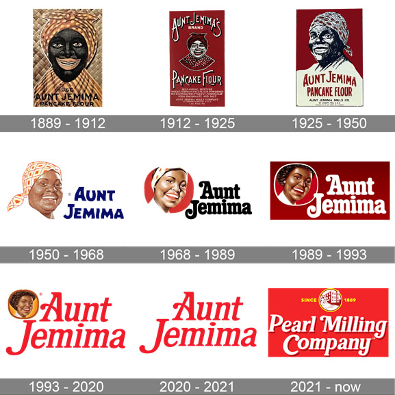
A prime example is the 2020 overhaul of the Aunt Jemima brand by Quaker Oats. The outdated and racially insensitive imagery was replaced with a more inclusive design, acknowledging the need for brands to evolve with changing societal norms.
Streamlining For Global Appeal
As businesses expand their global footprint, the need for a universally appealing logo becomes paramount. Brands often redesign their logos to ensure cultural nuances are considered and to create a consistent image across diverse markets.

Starbucks, renowned for its mermaid logo, underwent a strategic redesign in 2011. The intricate details were simplified, ensuring a cleaner and more recognizable image that transcended language and cultural barriers.
Adapting To Brand Evolution
Companies, like living organisms, undergo evolution. As they diversify their offerings or pivot their core values, logos may need to reflect these changes. In 2013, Yahoo unveiled a new logo to signify its transformation under the leadership of Marissa Mayer.
The redesign aimed to convey a sense of modernity and innovation, aligning with the company’s renewed focus on staying at the forefront of the tech industry.
Correcting Perceptions And Rebranding
A logo redesign can serve as a strategic move to reshape a brand’s image and correct any negative perceptions. Uber, a disruptor in the transportation industry, faced criticism not only for its business practices but also for its logo.

In 2018, Uber unveiled a redesigned logo, shedding the controversial ‘U’ and opting for a more sophisticated and universally appealing look. The move was part of a broader effort to redefine the brand’s identity and distance itself from past controversies.
Embracing Simplicity And Timelessness

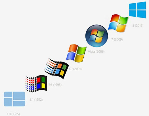
In the cluttered marketplace, simplicity often reigns supreme. Brands seeking longevity and timeless appeal may choose to simplify their logos. In 2013, Microsoft introduced a minimalistic redesign, moving away from the iconic multi-colored window to a clean, monochromatic window pane. The shift aimed to convey a more modern and versatile image, reflecting the company’s evolution beyond its traditional software focus.
Riding The Waves Of Design Trends
Design trends, much like fashion trends, influence the aesthetics of brand logos. Brands may choose to redesign their logos to align with contemporary design sensibilities.

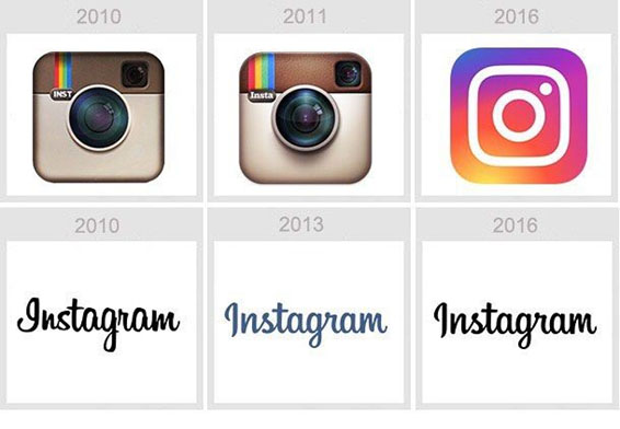
Instagram, a platform synonymous with visual content, embraced the flat design trend in 2016. The colorful, skeuomorphic camera icon was replaced with a simplified, vibrant gradient, aligning the logo with the prevailing design language of the time.
Eliciting Emotional Responses
Logos are not just symbols; they are emotional triggers that connect consumers with brands. A well-thought-out redesign can evoke positive emotions and strengthen brand-consumer relationships.

In 2019, Dunkin’ Donuts simplified its logo, dropping the ‘Donuts’ from its name. The move aimed to position the brand as more than just a doughnut shop, emphasizing a broader range of offerings. The redesigned logo subtly communicated a friendly and approachable vibe, resonating with consumers on a personal level.
Conclusion
Brand logo redesigns are not arbitrary; they are strategic decisions driven by a myriad of motives. From adapting to the digital age and cultural shifts to reflecting brand evolution and correcting perceptions, the stories behind logo redesigns are as diverse as the brands themselves. As consumers, we play an active role in decoding these visual narratives, and as brands continue to evolve, so too will the captivating tales behind their iconic logos.