Mirinda is an international beverage company that produces a variety of carbonated drinks, non-carbonated drinks, and juices. It is a subsidiary of PepsiCo, Inc., a global food and beverage company with operations in more than 200 countries. Mirinda was launched in Spain in 1959 and has since grown to become a leading global brand. Mirinda has a unique flavor profile that appeals to consumers in different regions and cultures.
Logo Evolution: The Start
The iconic Mirinda logo has gone through an evolution over the years. Since its inception in 1959, the logo has been adapted and refined several times to reflect the brand’s ever-changing identity. The evolution of the Mirinda logo is a fascinating story of how a brand’s visual identity has changed with the times.
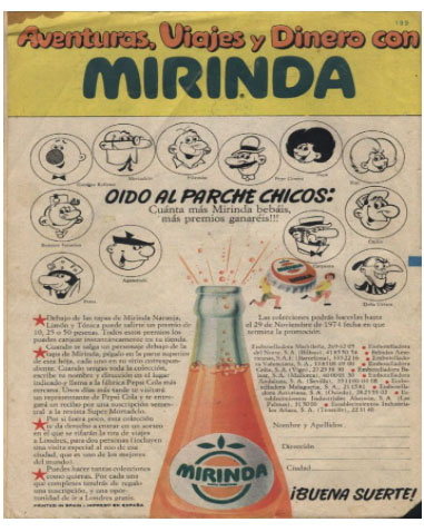
1959-1970: The Year of Originality
The original logo was a capital letter “M” which was highlighted by a dark green color that definitely caught everyone’s eye. It was recognized around the world for its bold and playful typography, featuring the brand name in uppercase letters that are brightly coloured in orange. This color palette was chosen to represent the refreshing and citrusy flavor of the brand’s soft drink, making the logo instantly recognizable amongst consumers.

1970-1986: The Year of Change
The 1970s saw a major shift in the logo of Mirinda, a popular soft drink. The original logo featured a blocky white font on a deep green background, but this was changed to a vibrant orange background with white lettering. Orange is a bright, cheerful color and is often associated with energy and enthusiasm, making it perfect for a beverage like Mirinda. The green lettering with white highlights also stands out well against the orange background, making the logo recognizable and memorable. The updated logo proved to be an effective marketing tool, helping to drive sales of Mirinda in the 1970s. The Mirinda logo of the 1970s remains an important part of the brand’s history, and it marks an important moment in the development of the company.

1986-1992: The Year of Dynamism
In the late 1980s, Mirinda decided to embrace a more contemporary and dynamic design. The typography was revamped with a playful and bold font, giving the logo a sense of movement and energy. The color palette featured a gradient of orange shades, symbolizing the drink’s refreshing and multilayered taste. The orange was also chosen to evoke the vibrant and energetic spirit of the brand. It had a hint of yellow shades to it. The Mirinda logo of the 1980s is a testament to the company’s commitment to modernity and dynamism.
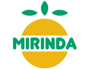
1992-1995: The year of Maximalism
The company decided to add a square orange background with the pre-existing orange logo with “Mirinda” written over it. This logo seemed more refreshing than the previous one and since it was the year of maximalism, the brand decided to adopt it and went with the trend.

1995-2001: The Year of Creativity
This year saw the company’s most creative logo. It consisted of an orange with splashes of juice and “Mirinda” written over it. The logo was aesthetic and was the company’s best logo.
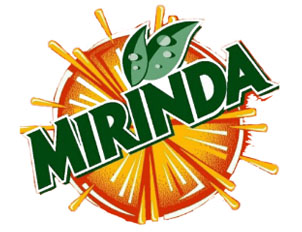
2000s: The Year of Rebranding
The new logo shifted to a simple, modern font that conveyed an approachable yet sophisticated vibe. The typography was also simplified, making the logo easier to read and understand.

In addition to the typography changes, Mirinda also shifted the color scheme of the logo to a vibrant and solid orange.Finally, the brand added a graphical element to the logo in the form of a stylized orange slice which provided a playful element to the logo, making it more engaging and memorable.
2010s: The Year of Revamping
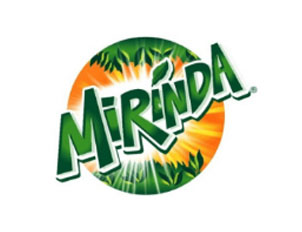
The logo returned to the theme of citrus fruits featuring a semicircle of fruit with visible slices beneath the name. Above the name, there was a graphic of squeezed juice, which gave the logo a sense of movement, liveliness, and energy. The idea of the Mirinda logo in the 2010s was original and different from other logos at the time The logo was also versatile and could be used both for print and digital media, as well as in other creative applications.
Present Logo
The company followed the present trend of minimalism and got rid of the orange and tangerine background. It only consists of green typography with “Mirinda” written on it.It also has a colorful background with a capital ‘M’ inscribed. The Gen-Z definitely connects with the authenticity of the logo.
Concluding Remarks
In Conclusion, Mirinda is a company that is very dynamic and follows every trend. We can see that every decade Mirinda has changed its logo to fit in and has been successful. Mirinda as a company has analyzed the customer’s references and worked towards it.