Introduction
Panchayat is a popular Hindi comedy-drama series on Amazon Prime Video, created by The Viral Fever. Directed by Deepak Kumar Mishra and scripted by Chandan Kumar, it stars Jitendra Kumar, Raghubir Yadav, Neena Gupta, and others. The story follows an engineering graduate who becomes a Panchayat secretary in the fictional village of Phulera, Uttar Pradesh, due to lack of better job options. Filmed in a real panchayat office in Mahodiya, Madhya Pradesh, the series premiered on April 3, 2020. It received rave reviews for its performances, direction, and rural setting, winning several awards at the Filmfare OTT Awards.

What is the ad about?
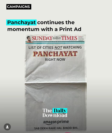
On Sunday, June 23rd, Amazon Prime Video grabbed attention with a front-page ad in The Times of India, celebrating its hit series ‘Panchayat’. The ad creatively highlighted the show’s immense popularity and its charming blend of humor and heartfelt moments.

‘Panchayat’, with an impressive 9.0 IMDb rating, has quickly become a fan favorite. Within just two weeks of its global release on May 28, the third season made history by ranking among the top three Indian originals on Prime Video. The ad cleverly used the series’ famous dialogue “dekh raha hai Binod,” which had already sparked a wave of memes before the season’s release, further boosting its buzz.
This ad not only showcased the love for ‘Panchayat’ but also played on the quirky charm of the series, making it relatable and engaging for fans. By featuring popular dialogues and celebrating the show’s success, Amazon Prime Video effectively drew attention to the series, ensuring it stayed on everyone’s radar. The campaign perfectly captured the essence of ‘Panchayat’, making it clear why the series has won the hearts of viewers across India.
The criticism
The advertising campaign of a popular show has been catching a lot of attention, but not all for the right reasons. The issue lies in a single missing letter in their Hindi grammar. In Hindi, when speaking in the present continuous tense to address a group (सब देख रहे हैं), ‘Hai’ should be ‘Hain’ to be grammatically correct and respectful. ‘Hai’ is used for singular nouns, while ‘Hain’ is for plurals and conveys respect.
Brand culturist Rupesh Kashyap took to LinkedIn to highlight this mistake. He pointed out that while writing Hindi or other Indian languages using the Latin or Roman alphabet (often called Hinglish or Tinglish), it’s important to maintain correct spelling and grammar. The way words are written shouldn’t change just because they’re in a different script.
Kashyap emphasized, “People should remember that writing Hindi in Roman letters doesn’t change its grammar. We must respect the language’s rules, even in informal scripts.”
This small mistake in the campaign’s slogan has sparked a discussion about the importance of maintaining grammatical integrity, even when blending languages. It’s a reminder that every detail counts, and respecting the nuances of language is crucial, especially in advertising. This oversight turned into a learning moment for both the brand and its audience.
How is this marketing strategy impactful?
Amazon Prime Video’s recent advertisement managed to stir up a mix of criticism and admiration. The controversy stemmed from a noticeable typo, which attracted the ire of many keen-eyed readers. However, beyond this “silly mistake,” the ad showcased an innovative use of the print medium that turned heads and captured attention in a unique way.
Creative consultant Sumanto Chattopadhyay highlighted this duality perfectly. He acknowledged the typo as a mistake but emphasized the brilliance behind the ad’s concept. By using a blank canvas, Amazon Prime Video broke away from the typical cluttered and busy advertisements. This minimalist approach stood out in a sea of heavily designed pages, compelling readers to pause and take a closer look.
Imagine flipping through a magazine or newspaper filled with colorful, information-packed ads. Suddenly, you come across a page that is almost entirely blank, save for a simple and direct message about Amazon Prime Video. This stark contrast naturally draws the eye, making the ad impossible to ignore. It’s a clever psychological play, leveraging the unexpected to create curiosity and interest.
While the typo was a blunder, it inadvertently added to the conversation, making the ad even more memorable. People started talking about the mistake, which, in turn, spread the ad’s reach further than perhaps initially anticipated. It’s a classic example of the adage, “There’s no such thing as bad publicity.”
The creativity behind using a nearly blank canvas speaks volumes about the evolving nature of advertising. It’s not just about delivering a message; it’s about how you deliver it. Amazon Prime Video’s approach shows that sometimes, less really is more. By daring to be different and embracing simplicity, the ad cut through the noise and made a lasting impression.
Conclusion
In essence, while the ad may have had a “silly mistake,” it also showcased the power of smart, innovative advertising. By thinking outside the box and using the print medium in an unexpected way, Amazon Prime Video created a campaign that was both criticized and praised, proving that creativity often lies in the simplest ideas.