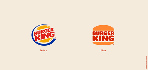
As so many brands are giving themselves a transformation, Burger King is also not behind in the race. It should be noted that rebranding helps any brand to come in the game again and reposition its value in the market.
In the month of January 2021, Burger King presented a new visual identity for all its fans across the globe. The fast food company is undergoing rebranding as it has changed its logo, packaging and also the uniform of their employees.
One more brand XIAOMI changed its visual identity after a decade . The designing of the logo was started in 2017 but the finalization was done in September. The officials quoted that “ the change was to unify its brand presence globally”.
Hang in with us and we will tell you everything you need to know about the changes.

The “NEW OLD LOGO”
The brand is undergoing rebranding after two decades (twenty years) since the year 1999. The brand purpose behind this change of logo is to give the brand an iconic and minimalistic identity which reflects about the food that they offer.
Its intended to make people crave for it and above all to show the perfection in taste. All these development is definitely giving it a new brand identity. The new logo also has a little old feel but with a modern touch. The brand has removed the color blue and shining buns and replaced it with flat buns with the name of the brand in between them.
It is similar to the logo it had in the year 1969. They also changed the colors with a new “flame” font. The current logo design still has the company name in between just like the old one . In the last 21 years it has not gone under any further changes.
The brand has updated its logo in some countries and is trying to cover it internationally soon.
According to a press release, the change in the logo particularly represents the new up gradation to food quality and taste by the removal of artificial colors and preservatives. The main idea behind this is to make it more healthier for consumers.
The designer of the logo Jones Knowles Ritchie said that “They took inspiration from the old logo in the 90s but made it modern” .The reason behind the change was that they wanted to pay homage to its old culture and heritage.
The uniforms of the employees is also being changed worldwide as Burger King’s CMO said in a recent interview with business insider that “The old uniform was very generic“. The new one, charcoal gray t-shirt with stripes on it tries to mimic the ingredients of a whopper. He also stated that the first thing which comes in our mind when we think about Burger King is whopper so having a whopper on our visual identity is really important.
CONCLUSION
Not just they transformed their logo but also they have stopped using artificial colours and preservatives in their food to make it more healthier for their customers.
So to put it in a nutshell, Burger King is not just rebranding itself but making some significant and important changes to keep its essence alive and the customers will have more healthier meal to munch on.