HIGHLIGHTS
* The designing process started in 2017
* World-renowned designer Kenya Hara is supervising the design
In September, Xiaomi presented a new visual identity for its new premium range of products.
Xiaomi dropped its ‘ Mi’ logo after a decade. The official announced that ‘This change is to unify Xiaomi’s global brand presence’.
The new logo will be incorporated in all the new products
Xiaomi is owned by BBK Electronics. BBK Electronics is the Chinese electronic empire. BBK Electronics also owns OnePlus, Redmi, Oppo, Vivo, and Iqoo.
Xiaomi’s parent company Mi is creating two distinct segments for Redmi and Xiaomi. Redmi and Xiaomi are the products of Mi corporate which is owned by BBK Electronics.
Redmi is targeting affordable segments while Xiaomi falls in the premium range. Xiaomi India has a 14% share in the 20-45K category of phones.
Jaskaran Singh Kapany, the marketing head of Xiaomi India told Times of India “ As a consumer-centric brand our focus has always been on bringing new innovative technology across segments that caters to the consumer’s evolving needs”.
The brand made some minor modifications to its corporate logo as well. The new logo is round in the corners.
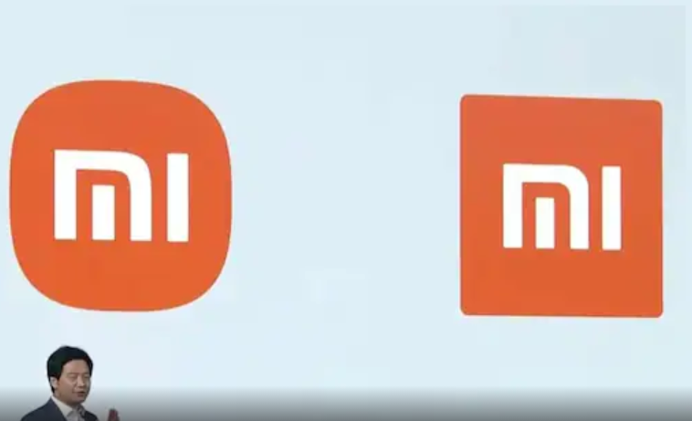
The logo is designed by Kenya Hara, world-renowned designer and President of Nippon Designer Center.
During the presentation of the new corporate logo, CEO Lie Jun revealed that the redesigning process started in 2017.
The logo largely remains the same but the new change makes it more aesthetically pleasing. The orange color of the logo represents liveliness which resembles the brand. The mathematical formula used by the designer is “superellipse”. The design aspects present infinite options between a square and a circle. This design is a perfect balance between a circle and a square. The round corners are more agile than the edgy corners, it represents the brand concept ‘Alive’.The design concept for rebranding ‘ Alive’ is under the supervision of Hara.
These changes are made for the overall rebuilding of the company’s brand identity. The new branding will help Xiaomi to go forward in the future of technology. Big companies focus on building a brand identity and that is different from brand image.
Oppo, Realme, and OnePlus are undergoing an identity crisis in the market. In times like this, it was a good business mood to reaffirm the brand identity.